Businesses of today have come to rely on the information that you can unearth through data collection and analysis. Knowledge is considered an invaluable asset that can help you and your team compete by implementing innovative strategies. As a result, companies have begun to offer programs like continuous learning and constant training in an effort to maintain internal knowledge and intelligence.
Unfortunately, gaining knowledge involves harrowing processes that can challenge your training, skill, and intelligence. This issue is what business intelligence software addresses. Such systems are meant to help you not only take advantage of the data that you’re already collecting but also make use of the information you didn’t think could yield insight. If you want to know more about business intelligence software, then read our guide.
This article focuses on two of the top-tier options available in the business intelligence market: Microsoft Power BI and Plotly. If you’re torn on which platform to get, then this comparison hopes to help you make the final decision through an in-depth review of both platforms.
Microsoft Power BI vs Plotly: Brief Introduction
Microsoft Power BI
Before you dive in, you need to get to know Microsoft Power BI and Plotly.
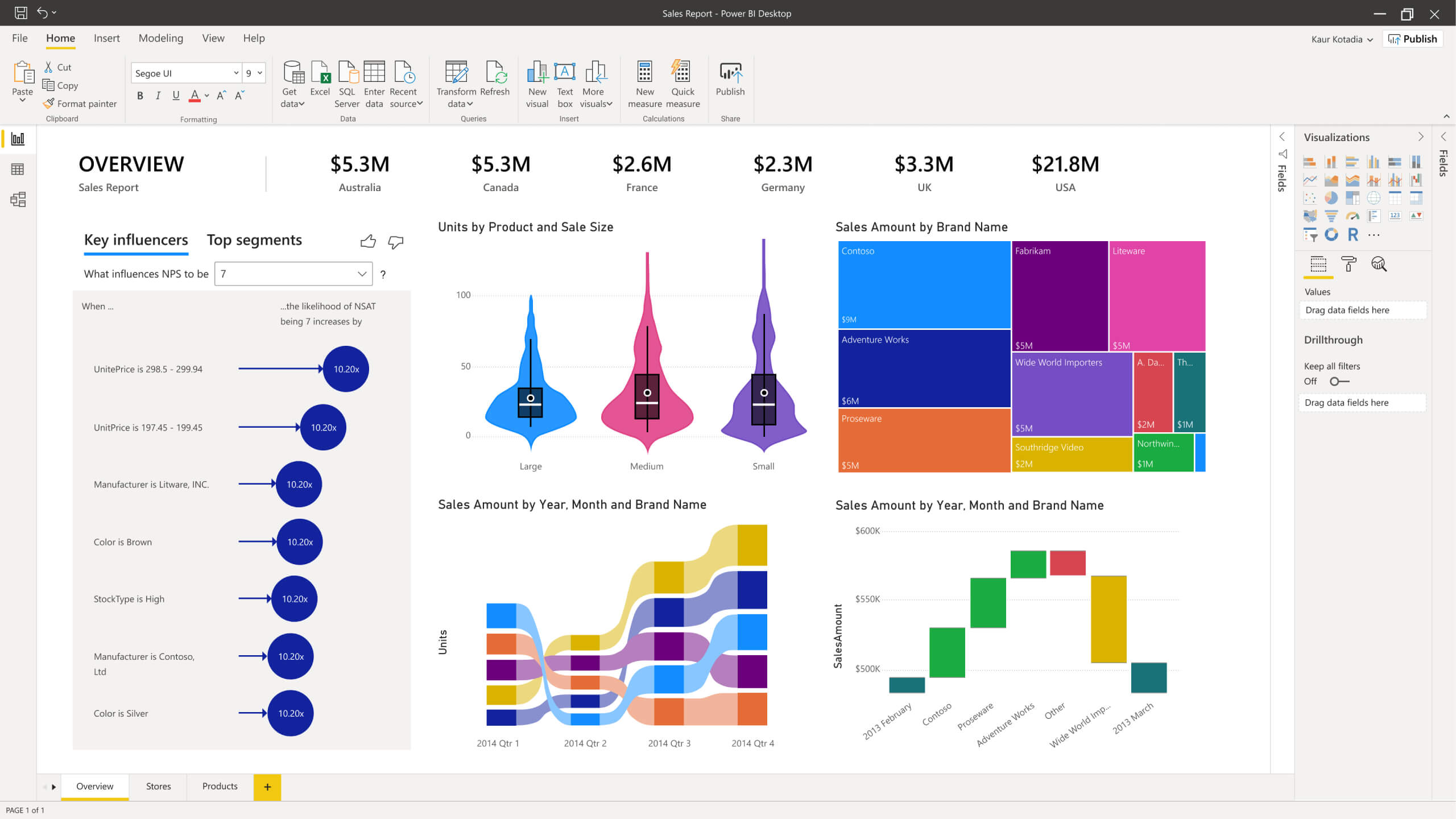
Microsoft Power BI places its emphasis on data visualization because it is through this feature that you and your team can both understand what the data is telling you as well as recognize any trends and patterns. This platform has steadily gained popularity over the years because of its visualization capabilities as well as the apps it integrates with.
On the other hand, Plotly caters to a different audience in that this platform focuses on leveraging open source tools to help you and your team create and distribute data, whether in chart or map view, among other options. It also leverages the benefits of business intelligence and machine learning – two technologies that can help you in collaboration, data analysis, and visualization.

Microsoft Power BI vs Plotly: Features and Capabilities
Given what these platforms emphasize, this Microsoft Power BI vs Plotly comparison further illustrates their differences based on the features and capabilities that you and your team can get from their systems.
Analytics
Microsoft Power BI and Plotly both approach data analytics from different angles.
Power BI enables you and your team to leverage enterprise-level analytics without the help of data professionals and even IT developers. This platform’s self-service implementation gives you the capabilities of Adobe Analytics Cloud and Azure Synapse Analytics, which are two of the most sought-after analytical platforms even by large enterprises. Furthermore, Microsoft Power BI adds an application lifecycle management toolkit and paginated reports to its long list of analytics-specific features.
Plotly takes a different approach. Its implementation strategy helps you and your team create analytical web apps while simultaneously enabling you to maximize advanced analytics. With the use of Python, R, and Julia, you and your team can offer data science initiatives. Plotly also offers Dash, a tool that can help you improve your web apps by offering dashboards that are built using machine learning, neuro-linguistic programming, and forecasting, among others.
Data Visualization
Aside from analytical capabilities, another feature that you should consider when looking for the business intelligence software for you is data visualization, which you can learn more about if you check our data visualization software research.
Microsoft Power BI approaches this category with the help of artificial intelligence (AI), which helps you and your team access smart tools. In turn, these tools can assist you and your team in finding the insights you need to see and share it with anyone who needs to know. You can also use this platform to access global data centers, which can help you address compliance and regulation issues before they happen.
On the other hand, Plotly offers visualization capabilities in a way that doesn’t require you and your team to have any knowledge and training on coding. This platform achieves this through a straightforward data import function, which enables you to upload your files, URL, and even through an SQL platform. Plotly offers a Chart Studio wherein you and your team can collaborate and create interactive data visualizations that you can then share with websites and stakeholders.
AI and Machine Learning
The use of AI and machine learning (ML) technologies in business intelligence software may be the reason why you’re looking into such systems. In this category, both Microsoft Power BI and Plotly ensures that you and your team have access to these technologies.
Aside from the smart tools mentioned above, Microsoft Power BI also leverages AI technology by helping you and your team prepare the data for analysis without needing to hire a data scientist. This platform enables you to build machine learning models, which you can then use to unearth insights from any type of data, whether structured or unstructured data, text, or images.
On the other hand, Plotly’s Dash uses machine learning to help you and your team achieve a more efficient workflow by cutting down the time and effort needed in creating web apps and business research. Like some of the best bug tracking software in the market, Plotly’s Dash allows you to not only deploy AI and ML business apps but also keep track of it to ensure that you can easily add improvements and track app performance.
Integrations and Deployment
Because data analysis and business intelligence rely heavily on the systems that you use for collection and organization, this Microsoft Power BI vs Plotly comparison also takes a look at each platform’s integrations. Moreover, the deployment category deals with how you’ll be able to access the platform as this article considers how you may want to see your analytics or your apps anywhere, anytime.
Both Power BI and Plotly utilize API for its integrations, which enables you and your team to add the applications or systems that you need to help you achieve an efficient workflow. In addition, Microsoft Power BI integrates with other Microsoft apps, such as Office 365, as well as Azure services, such as the Azure Data Lake Storage. Meanwhile, beyond its API integrations, Plotly also integrates with other open-source libraries like Python, R, and Julia – all of which can help you create and develop BI and data visualization apps without the need for complex coding.
Deployment is where Plotly falls behind Microsoft Power BI. Whereas Power BI is available for your PC, iOS, Android, and Windows devices, Plotly only supports Windows and Mac devices. That said, you can access both through any web browser, which is essential if Plotly is to provide the same level of accessibility as Power BI. Finally, Plotly offers an on-premise deployment option, which may be essential if you have the servers to support this platform, and if you want more control over its security.
Pricing
This Microsoft Power BI vs Plotly comparison isn’t complete without a discussion on pricing. Microsoft Power BI offers three packages: Power BI Free, Power BI Pro, and Power BI Premium. On the other hand, Plotly has separate packages for its cloud and on-premise options.
The free plan of Microsoft Power BI provides you and your team with all its basic features, which include data exploration and data imports, among others. This plan is perfect for small teams. If you choose to upgrade to Power BI Pro, this platform offers you the ability to publish reports, cloud and datacenter access, and data visualization, to name a few. Finally, the Power BI Premium is the plan to get if you need all of this platform’s capabilities. This package is where you unlock the benefits of Power BI’s integrations as well as AI and machine learning activities. The Power BI Pro plan costs $9.99 per user per month, while the Power BI Premium plan will set you back $4,995 per month.
Plotly’s packages, while straightforward, can be overwhelming, especially since this platform offers multiple options for you to choose from. These pricing packages are quote-based, which means that you’ll have to contact the vendor, but you can have a more meaningful conversation with Plotly if you know what type of deployment you want to get. After that decision, all you have left to choose from is which package can best meet your needs, whether you’re a student or a large enterprise leader.
Microsoft Power BI vs Plotly: Empowering Through Knowledge
Microsoft Power BI and Plotly offer the benefits of business intelligence for varying intended purposes. Microsoft Power BI is the better choice for those who need business intelligence to create and distribute informative and interactive data visualizations. This platform is also more appealing for users who already complete workflows with the help of other Microsoft apps.
On the other hand, Plotly is the perfect option for those who need business intelligence to create web apps that offer AI and machine learning features. Data scientists and IT professionals are the most likely to benefit from this platform’s capabilities. That said, Plotly can still cater to the needs of those who need a business intelligence platform that can yield insights on a given data.
Given everything you need to know about Microsoft Power BI and Plotly, the only thing left for you to do is to make the final decision. Both platforms are powerful in their own right. As such, you need to ask yourself why you need business intelligence and go from there.