We are now in an age when data is already considered a commodity. As almost all businesses and individuals take their data to the digital realm, tons of data are generated every day. And just like finding needles in a haystack, it can be a challenge to manually find and sort data that you require.
However, it’s one thing to locate data; it’s another to present it in such a way that they are understood by your audience. Regardless of profession and education, everyone will appreciate being presented with figures, facts, and data that they can interpret and analyze at a glance. This is where data visualization comes in.
Data visualization allows you to tell interesting visual stories out of otherwise boring and overwhelming information. It helps you highlight and compare important points and trends.
Now, presenting information and data in the manner described above isn’t as simple as dumping graphs and design together, then call it an infographic. Effective data visualization requires balancing form and function. Plain graphs can be boring to look at and may fail to catch attention, but too much design might distract your audience from the real focus.
Data visualization is both art and science, and it is best performed using the right tools. In this post, we take a closer look at what data visualization software does, as well as its examples, features, benefits, and types, among other information.

Data Visualization Software Table of Contents
- What Is Data Visualization Software
- List of Best Data Visualization Software
- Key Features of Data Visualization Software
- Types of Data Visualization Software
- Benefits of Data Visualization Software
- The Latest Trends in Data Visualization
- Potential Issues in Data Visualization Software
- Data Visualization Software: How to Choose the Best
What Is Data Visualization Software
Put simply, data visualization is the manner of presenting information and data graphically and visually. It utilizes elements such as graphs, charts, and maps. Colors and patterns are then incorporated in the presentation for quick identification and analysis. Through data visualization, it becomes easier for the audience to consume huge sets of data.
Data visualization software provides users with tools that can help them create visual data representations faster and easier. It is used to analyze raw data and convert it into visual charts, tables, and figures. Just like data analysis software, these programs allow you to process huge datasets, as well as recognize relationships and patterns out of business variables with ease.
The visualizations you can create using a data visualization software can be used for a number of purposes, including sales and marketing reports and materials, team and department quarterly and annual reports, and investor presentation decks.
List of Best Data Visualization Software
Every day, tons of data are generated by both humans and devices. More people already realize the importance of leveraging data to make better business decisions. Because of the increasing demand for high-quality data visualization software, a lot of options are now available on the market. To help you in your search for the best data visualization software, you can start by checking out these tools:
- Tableau: As one of today’s leading business intelligence solutions, Tableau offers data processing and visualization tools that help organizations all over the world find data-backed opportunities to drive their business forward. It supports the handling of very large and fast-changing datasets. It features a range of native data connectors and mobile-ready dashboards. Tableau also comes with flexible pricing and deployment options. Users can choose to deploy it in the cloud or host it in their own local server. They can also select between single-payment licenses and annual subscriptions. Because of its flexible payment and deployment policies, Tableau is accessible to businesses of all kinds and sizes.
- Qlik Sense: Formerly QlikView, Qlik Sense is another business intelligence solution that allows users to generate their very own guide analytics apps that different departments across their organization can utilize. This solution uses natural search to navigate through complex data and speed up discovery. Besides its default connectors, it also features custom connectors that you can install as necessary. It also supports an extensive range of APIs, allowing you to connect it with different business apps and systems. QlikView comes with a free basic cloud, enterprise, and personal editions. Paid plans with complete features start at $15 per user per month.
- Highcharts: This is an interactive charting solution purely based on Javascript. With a simplified interface, Highcharts allows you to integrate multiple charts to your website. It features a wide range of chart formats, such as box plot, bubble, error bars, waterfall, funnel, column, pie, and bar. It is known as the simplest and most flexible open-API data visualization software available today. Non-commercial website owners can use Highcharts for free. This free version already comes with efficient features. Meanwhile, corporations can choose from different types of licensing options and pricing. As businesses and enterprises tend to handle bigger data, they may eventually find Highcharts’ paid solutions more suitable for their requirements.
- Datawrapper: An innovative data visualization tool, Datawrapper was designed to meet the needs of developers, designers, and journalists. This open-source solution enables users to create interactive and responsive maps and charts. It also speeds up data conversion from online sources, CSVs, and PDFs to beautiful yet accurate and easy to understand charts. What’s more, making charts using Datawrapper does not require coding skills. Datawrapper comes with a free plan, while paid plans start at $29/month.
- Plotly: This open-source tool is made to create, modify, and distribute graphical and interactive data online. With this tool, users can not only create visually appealing and easy to interpret charts but also collaborate on their creation and editing. This collaborative technique allows teams to finish their tasks faster. Plotly offers rich visualization libraries that the public can access and utilize at no added costs. This program is offered in different deployment options and pricing plans.
- Sisense: This is one of the top business intelligence software available nowadays. This platform allows users to visualize information and data that can help them make better and wiser business decisions. It is powered by agile analysis and comes with a wide range of data visualizations. With the tools Sisense provides, users can create graphical representations as well as dashboards with drag and drop user interface. These representations and dashboards are also sharable.
- Infogram: Designed for business strategists, executives, marketers, and other organizations and individuals that may have a need to visualize data, Infogram provides a range of tools for structuring and representing data the way that informs and dazzles the audience at the same time. Its library of tools includes interactive charts, maps, icons, images, drag-and-drop editor, and ready-made design templates. Its basic plan can be used for free, while the paid plans start at just $25/month.
- ChartBlocks: Developed to help people create good-looking charts easily and quickly, ChartBlocks does not require any coding skills. Users can make graphical representations in minutes with ChartBlocks’ numerous customizable chart types. It also allows users to pull data from various sources. Its data import wizard will guide you through the process every step of the way. Additionally, this solution allows you to embed the charts you create into any website and share them through the built-in social media sharing tools. Individual users can take advantage of the free personal plan. The professional package is priced at $20/month.
- FusionCharts: Here’s another data visualization software based on Javascript. It features over 150 chart types and 1,000 map types. FusionCharts supports integration with other JS-based platforms, such as jQuery, Angular, and React. FusionCharts gives users access to ready-to-use codes for chart and map variations. As a result, they can easily embed the charts and maps into their websites even if they don’t have professional-level website design and programming knowledge.
- Looker: This data visualization software utilizes popular modeling language for the creation of attractive and accurate data representations. Looker also facilitates seamless data collection and consolidation. Furthermore, it has tools that help users create reports quickly and gamify data analytics as well. It also supports collaboration.
- ChartExpo: ChartExpo helps you dig deeper into your data and helps you discover invaluable insights that no one else saw, inspiring positive change. ChartExpo’s library is always growing to include new visualizations. As your data needs to evolve, the ChartExpo gallery grows right alongside them. Tool pricing starts at $10 per user/month.

Shapes, colors, and other visual elements help people interpret information and data faster and easier. (Highcharts)
Key Features of Data Visualization Software
The primary purpose of data visualization systems is to make big data comprehensible to everyone, even those who are not data and tech-savvy. To make this possible, data visualization software have these features in common:
- Efficient data visualization and reporting tools: What’s a data visualization software without data visualization features? These are the tools that allow the automation of data analysis and the creation of the visual representation of the analyzed data.
- Customizable dashboards: For users to be able to get the most out of the data they have and create visualizations the way they deem fit, a data visualization software should have a customizable dashboard that allows the selection of tools and metrics.
- Location intelligence: With this feature, it will be easier to map out geographical data.
- Data mining: This is the process of discerning patterns and trends in huge datasets and it should be present in data visualization software for more efficient data representation.
- Data cleansing: Meanwhile, this process sorts redundant and inaccurate data and allows for the faster and easier removal of unnecessary data.
- Mobile support: Real-time access can come in handy when you need to create and edit visual graphs and reports on the go.
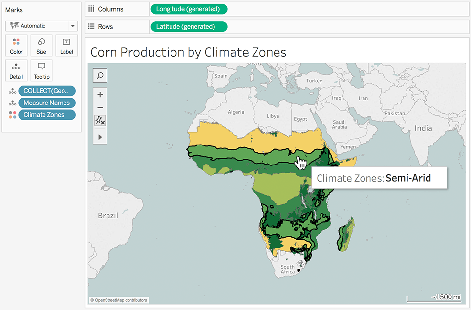
Location intelligence makes for faster data mapping. (Tableau)
Type of Data Visualization Software
Data visualization software come in two basic types:
- On-premise: Data visualization software of this type is installed on the user’s computer. It utilizes the user computer’s resources and as a result, can be customized to meet the user’s needs.
- Cloud-based: Data visualization software hosted by the vendor and accessed by the user via the internet is cloud-based and offered as SaaS software.
Benefits of Data Visualization Software
When harnessed properly, human visual processing can efficiently help detect variations, changes, patterns, and relationships in even the most complex datasets. Data visualization software is designed to help people and organizations make that very aspect work for them. Here’s a list of the other benefits of data visualization software:
- Real-time data interaction and analysis: As data is visualized, users and audiences are able to manipulate, leverage, and interpret data.
- Identification of data trends and relationships: With data visualization, you can easily detect patterns and trends from data, which you can then use to come up with data-backed conclusions and strategies.
- Behavior analysis: If you want to have an accurate view of customer behavior, for instance, you only need to look at visualized data representations.
- Business predictions: Data visualization software also helps you predict where your business is going, which allows you to change and develop plans as necessary.
- Better message conveyance: Sometimes, you simply want to convey information in a way that everyone can easily understand. This is the kind of software you need to do just that.
The Latest Trends in Data Visualization
Data visualization software will be a part of business intelligence and related processes for what looks like forever. This is why it’s important to know the trends shaping its present and future so you’ll know what to expect as you utilize one. Here are the most prominent ones currently:
- Artificial intelligence: AI is practically everywhere, and for the most part, it’s a good thing that it is. In terms of data visualization, machine learning will make data mining, sorting, and visualizing even faster and more accurate.
- Visual storytelling: People get bored fast. Sooner or later, visualization might not be enough. Storytelling could be the new thing as it can engage people’s attention better.

Various visualization options and tools lead to effective data storytelling. (Looker)
Potential Issues in Data Visualization Software
Data visualization can significantly help any organization, no doubt about that. However, no technology is perfect. Using data visualization software also comes with issues and risks, including the following:
- Cost: Some of the more popular and top-rated data visualization software come with a hefty price tag. Thankfully, there are free plans that individuals and SMBs can utilize.
- Adoption: Data visualization may require some learning curve. If your team is not as tech-savvy as you would want, adoption could take time. This may also lead to the underutilization of data visualization software. To remedy this, get started with solutions that are known to be easy to use.
- Inaccurate and insufficient data: Even if you have the best data visualization software at your disposal, if you have inaccurate and insufficient data, you might not be able to generate good data representation.
Data Visualization Software: How to Choose the Best
Regardless of the size and type of your business, you can find data visualization software useful. You can take advantage of its benefits even more if you choose the right solution for your needs.
One of the things you need to determine is how much data are you looking to process? Smaller businesses might also have smaller datasets, so free and simpler solutions might prove enough for their requirements. Meanwhile, bigger enterprises would do well to invest in higher-end software.
You should also decide whether to get an on-premise or SaaS software. Would you like to install the software on your own computer or leave it in the cloud? To answer this, you’ll have to look at what’s most convenient for you and what your technical capabilities are.
It’s also important to gauge the software’s ease of use in relation to your knowledge of data analysis and representation. Ultimately, when choosing a data visualization software, it’s more crucial to know how it will benefit you instead of simply looking at its list of features. A good way to know if a solution does what you need it to do is to take advantage of free trial if available.