In the field of UX design, the state-of-the-art is a moving target. So it’s easy for today’s best practice to morph into tomorrow’s deficiency. And the reason for it is simple: users are fickle.
To keep up, most UX designers rely heavily on A/B testing. The idea is to replace their original assumptions with real-world data about how people interact with a given product. But A/B testing is no panacea.
That’s because A/B testing has some limitations when it comes to UX. There are vast parts of an overall user experience that don’t lend themselves to a simple this-or-that comparison. So UX designers need to understand when A/B testing is appropriate, how to design their tests or even opt for app redesign.
To help, here’s a guide to the signals that indicate when A/B testing is the right tool for UX fine-tuning.
We’ll discuss each of them and what they mean. And then, we’ll discuss the four core components that make for high-quality UX A/B testing, and a few examples of successful UX A/B testing. Let’s get started.
To Test or Not to Test
When you’re in the design phase of a website or app, everything you do will be in some way based on assumptions. And in most cases, those assumptions will rest on your prior experiences or the wishes of your client. Chances are, however, many of those assumptions will be wrong.
That’s why usability testing is typically a core component of early design workflows. It’s a way of getting direct user feedback from the target audience to iron out any aspects of the UX that might hinder real-world users. But usability testing only takes you so far.
While it will help you address any glaring deficiencies in your UX, it won’t tell you if the solutions you choose are the best ones. All you’ll find out is what works and what doesn’t. For that, you’ll need A/B testing.
A/B testing, sometimes referred to as “split testing” is a process of experimentation using two or more variations of a product, service, marketing tool, management process, etc. It’s used to determine the best solution to maximize efficiency, productivity, sales, and a host of other common business outcomes.
Split testing tools may include virtual private network tools that divide and test a product or service in different geographical locations. It may include the use of browser testing tools, analytical tools for customer behaviour and rich media tools (think video, imagery, text, etc) to determine the best marketing channels for a product or service.
In web design, A/B testing allows the UX designer to compare specific variations of UX elements to see which works better from the user’s point of view. But not every UX element needs A/B testing. It’s actually counterproductive (from a UX point of view) to run A/B tests unless you have a real reason to. Fortunately, real-world usage data will do a pretty good job of giving you reasons, if you know what to look out for.
Specific User Complaints
The most obvious signal that an A/B test might be a good idea is if real-world users start giving negative feedback about a particular part of your UX. This can come in multiple forms. You may be getting negative feedback through customer service channels, requests for support, or product and service reviews. And when any of those things start to happen, it’s time to start designing an A/B test.
In this case, you should begin your efforts by reaching out to users that provided feedback to ask them for more information. Try to look for commonalities in their responses that may indicate a consensus preferred solution. Then you’ll know exactly what to test.
Performance Declines
The next obvious signal that indicates a need for A/B testing is decreasing performance. But not all performance signals are created equal. For example, if you’re examining a conversion page that wasn’t working well, to begin with, but now isn’t working at all – an A/B test isn’t going to help.
For performance to be a meaningful signal, in that case, you must have had enough traffic and conversion activity to make an A/B test statistically significant. Otherwise, your test will be vulnerable to random variance and might lead to an errant result.
You must have a large enough sample size to exclude the possibility of chance polluting your results. If you’re having trouble figuring out what that looks like in your particular case, you can try plugging some hypothetical data into an A/B testing calculator or your preferred A/B testing software to test your assumptions.
And even then, you might not find success right away. According to analytics expert Kaiser Fung, “I’d estimate that 80 to 90 percent of the A/B tests I’ve overseen would count as ‘failures’, meaning they didn’t yield a clear statistical winner. But he goes on to observe that failed tests have value anyway, saying that “Far from being a waste, confirming you’re on the right track avoids unproductive use of funds while redirecting the team’s energies to more useful projects.”
And in the case of addressing performance declines, unsuccessful tests might let you know that your UX design isn’t at fault. It could tip you off that there’s an issue somewhere else – like declining product demand or the addition of a new market competitor – that’s to blame.
Functionality Problems
Functionality problems – or more specifically, reports of them – are another signal that an A/B test is required. This may be in the form of bug reports or help requests, and they’ll indicate one of two things: either that there’s a technical problem (something broken) that needs fixing, or that something about the UX is unclear to a significant part of the user base. In the case of the latter, an A/B test is required.
As in the case of complaints, the first step is to reach out to the affected users and try to see if there’s a coherent logic to the issue they’re having. If so, that should form the basis of an A/B test. But if not, you’ll have to resort to additional usability testing to uncover the source of the problem.
Forced Changes and Updates
The last major signal that indicates the need for A/B testing is when there’s a request to make changes or additions to an existing UX. This happens when you need to alter things like product descriptions, site copy, or even to add whole new features to existing workflows. For example, add a password manager. This will improve data security. In situations like that, A/B testing will let you know how your changes might impact your existing product metrics.
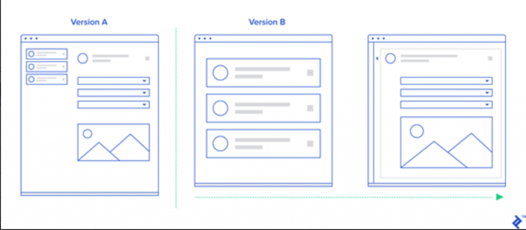
In fact, you can use A/B testing to test out new features and evolve them until they deliver comparable performance to the original product. According to UX expert and VC investor Andrew Chen, an A/B test of an added feature will almost always result in poor performance at first. But instead of calling the new feature a failure, he suggests that:
“What you do is leave [the new feature] in, but only expose 10% of your users to it. Then keep making small updates to the design, working on the copy, call to action, and other aspects, until the new design performs as well as the original. In this way, you can update your product without impacting the numbers negatively.”

Courtesy of Toptal.io
And there are some other kinds of product-wide changes that can affect UX and that may benefit from A/B testing. A prime example is something like the movement or alteration of branding components or company logos. For example, even a subtle change to a website color scheme can alter a user’s perception of an entire page or product. So it’s always wise to conduct thorough A/B testing on things like that to assess the UX impact of the change and to consider those effects as part of the cost of logo design in the first place. You (or your client) may find that the existing branding isn’t worth changing, after all.
The Core Components of High-Quality UX A/B Testing
The secret to using A/B testing to make positive changes to UX is to make sure to design every test you run in the right way. And where UX is concerned, four specific core components make for high-quality UX A/B testing. Here’s what they are.
1. Consider How a Proposed Change Relates to The Five UX Planes
In a marketing context, an A/B test is typically designed to look for a boost in a particular metric. It might look for increased conversion activity or a decreased bounce rate. And it wouldn’t be too concerned with the bigger picture. UX designers don’t have that kind of luxury.
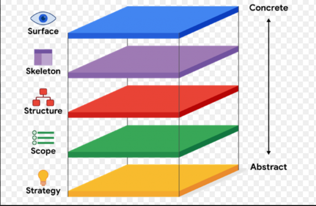
When designing A/B tests in a UX context, it’s necessary to think about how the proposed changes will impact all five planes of the UX as a whole.

Courtesy of Uxdesign.cc
In other words, UX designers can’t be concerned with the results of a given A/B test in a vacuum. They have to think of the changes they’re going to test in the context of how they’ll fit into the broader product. For example, changing a button style on a particular page may work for that single page, but could cause trouble if implemented elsewhere for consistency’s sake. So it’s critical to design tests that won’t upset the delicate balance that they’ve already created just to improve a single metric.
2. Always Pair A/B Tests With Qualitative Testing to Validate Results
In UX design, it’s not enough to know that a given change to a design creates better results. It’s also necessary to understand why it’s driving those results. Otherwise, it’s impossible to draw any lessons from the exercise – only conclusions.
So it’s important to pair every A/B test with matching qualitative research that can explain what’s driving the changed user behavior. Ideally, that research should involve some of the same users present in the A/B test’s data. But where that’s not possible, replicating the A/B test among a smaller group is an acceptable substitute. As long as your A/B test results yielded a high statistical certainty, the same reactions should show up among the smaller group to provide the insight required.
3. Create Time-Limited Tests
When it comes to A/B testing, it’s critical to achieve statistical significance. But if you’re trying to test a low-traffic page or lightly used product element, you may end up having to run your test for so long that it begins interfering with ordinary operations. And from a UX perspective, that’s when A/B tests become counterproductive.
Imagine, for example, that you’ve changed the location of a submit button on a data collection page. If you show that change to 40% of that page’s visitors for two weeks, they’re not going to react badly when you change things back. But if you go much longer than that, you’re going to create a serious UX problem.
This is because it takes people as little as 18 days to begin forming habits – like adjusting to a layout change of a website. So if you allow your tests to go on for longer than two weeks, you’re going to start to interfere with the user experience of a significant portion of your users. And if you do that too often, you’ll soon run out of subjects for your A/B tests.
4. Reduce or Eliminate External Factors First
Before resorting to an A/B test, it’s also essential for UX designers to identify and eliminate any external factors that could be causing the issue the A/B test seeks to improve. That’s because, from a UX perspective, change for change’s sake is never a good thing.
For example, if the bounce rate of a particular page begins rising, it’s not safe to assume that users’ tastes have changed. The page might simply contain outdated information, broken links, or missing graphics. Or, there could be a page loading issue that has nothing to do with the site itself that’s harming the user experience. And then you’d be better off taking the issue up with your web hosting provider rather than spending your time looking for a solution via an A/B test.
Examples of Effective UX A/B Testing
The good news for UX designers on the fence about using A/B testing is that there are countless examples of companies that have used the tactic to improve their products. There’s no better example of it than Netflix – which, according to former Chief Product Officer Neil Hunt tests “nearly everything” about their UX and any proposed changes to it.
One of their most effective uses of A/B testing even ended up becoming a core part of their UX strategy. They began to prepare at least six image versions for all of the new content that joined their catalog. And then they’d A/B test the variants to find the one that most effectively attracted viewers. The tactic led to an average 20% to 30% increase in viewers for the titles added using the method. And that led to a new algorithmic approach to rotate the images based on user preferences.
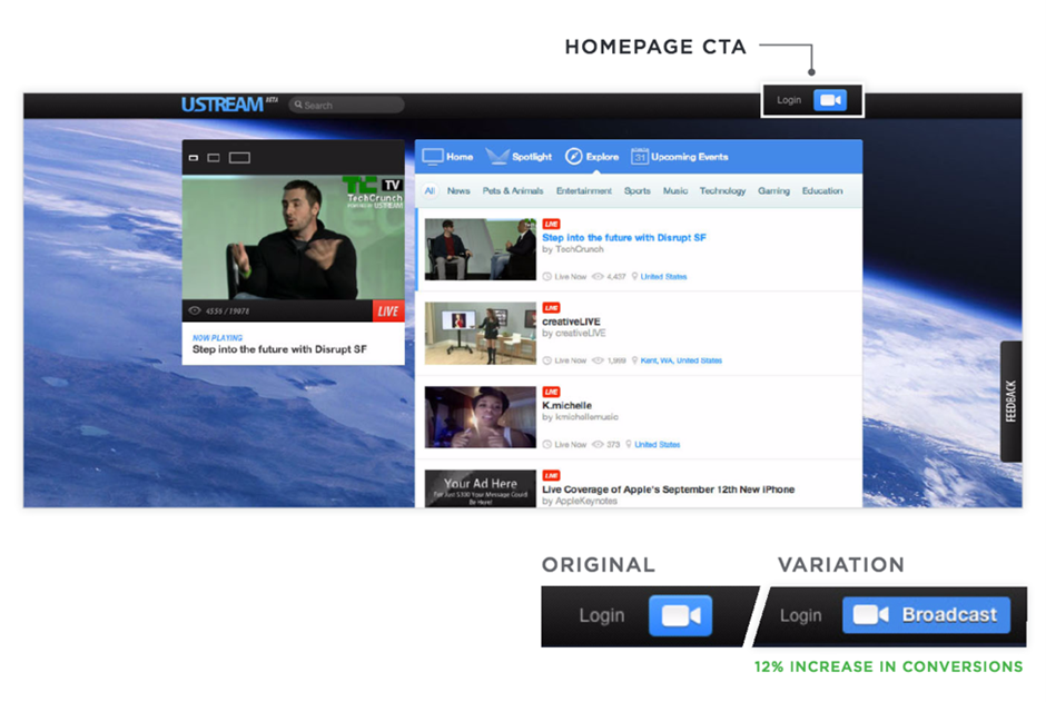
And Netflix isn’t alone in using effective A/B testing to improve their UX. Video broadcast platform Ustream used A/B testing to increase its number of broadcasters by figuring out how to shepherd users to its streaming options right from its homepage:

Courtesy of Themanifest.com
Their testing resulted in a 12% increase in user stream creation, which helped cement the platform as a premier content provider alongside the likes of YouTube and Twitch. That boost then led to Ustream’s acquisition by IBM, which used it to form the basis of a brand-new cloud streaming offering.
And then there’s Booking.com, which has used A/B testing for over 25 years to inform its customer-facing product design. Among other significant improvements, their testing led to a redesign of the platform’s primary rental property signup page:
<iframe src=”https://www.linkedin.com/embed/feed/update/urn:li:ugcPost:6834339356170317824″ height=”1275″ width=”504″ frameborder=”0″ allowfullscreen=”” title=”Embedded post”></iframe>
The resulting page delivered a 25% boost to property owner registrations and significantly reduced the user acquisition cost. It’s a perfect example of a UX change that improved usability so much that it practically reinvented the whole product – allowing it to compete with more established rivals like Airbnb and VRBO.
The Bottom Line
By now, it should be clear that A/B testing can be an excellent tool in your UX arsenal – if you know when and how to use it. But it’s not an all-purpose tool. That’s why running A/B tests only in response to specific feedback signals is advisable, and then only when you design your tests correctly. Otherwise, there’s a very real risk of creating more UX problems than you’ll solve through A/B testing. So tread lightly and approach your tests with the care required to make them worthwhile.

1 comment
Great point. Can’t agree more – many times a new feature or an important article gets less exposure when we didn’t put it in the right position. Thus, making small updates on design is a great way to fine-tuned and get the important content exposed to users easier.
The rule of thumb that I keep reminding myself of is the 3-click rule. No page should take more than 3 clicks to access.